Trello is a task management tool that allows users to create boards, lists and cards that enable you to organize and prioritize projects in a fun and flexible way. It is one of the simplest task management tools that I have ever used.
This article was originally written a couple of months ago before Trello started making a big push toward getting enterprise teams on their product. Since making the push for teams, Trello has changed their onboarding experience significantly, so we'll do a comparison of their onboarding before and after the change.
Homepage
The homepage is one element that has more or less stayed the same. I'd like to draw attention specifically to the minimal navigation and extremely clear call to action. They might have done some research and determined that having things like "About", "Pricing", etc... were too distracting.

Signup Page
They only ask for one thing: your email. This step hasn't changed at all, and we love the fact that it's so simple. After you enter your email, they ask for basic info like your name and a password for your account.
A really nice quality of life feature they have is the social login buttons disappear after you start typing in your email, so there's only one remaining action button on the screen ("Continue") and you don't get confused by all the other buttons.

Welcome Screen
Before
Notice how they don't ask you to confirm your email yet. They purposely take you straight to the onboarding tutorial so you can see the value you get from using Trello immediately (they ask you to confirm your email later).

After
The new welcome screen has changed significantly since Trello started transitioning to catering to teams. The new screen asks for a few more piece of info that are pretty standard across major competitors like Asana, Monday.com, etc. Trello asks for your team name, the type of team (sales, marketing, engineering, etc.) and email addresses of any team members you'd like to invite.

The next screen is a pretty hard upsell for their Business Class Team plan. They highlight the major advantages of the Business Class Team over the free plan with an enticing 30 day free trial. I understand why this might be necessary, but I honestly don't like the UX here.

The primary action button is a button to start a 30 day trial of their Business Class Team, whereas the button to continue to your standard Trello account is placed lower and has a less contrasting color. It's a little misleading for users and I'm sure a good number of people clicked on the 30 day trial button since it was the primary action button, without seeing the muted button below.
If you choose the 30 day free trial, you must first verify your email and add a billing method before you can proceed to your Trello dashboard. On the billing screen, there once again is a muted option to continue with a free plan instead.
Board Creation Tutorial and Feature Introduction
Before
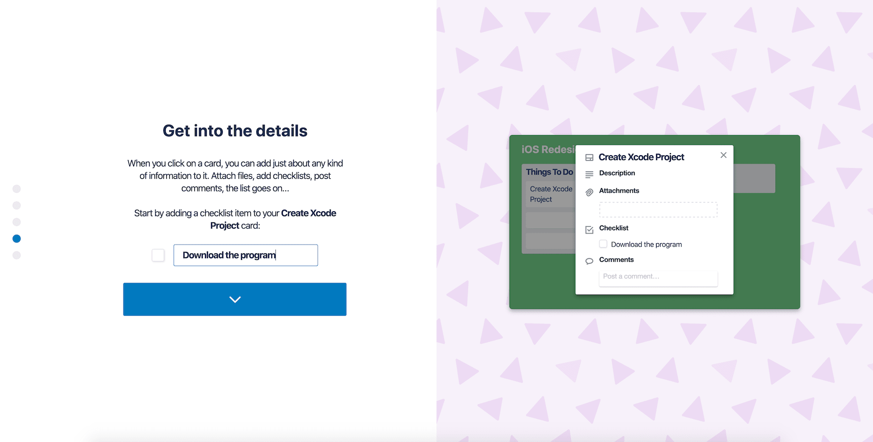
I absolutely love this part of their onboarding flow. These few screens help you create your first board and introduce you to Trello's key features. This is great because it reduces the chances of the user misusing the product and helps them get up and running as quickly as possible. It doesn't overwhelm you with a lot of menu options, it's a simple straightforward tutorial to get you off the ground.

After
I think this area is where Trello's new onboarding flow falls short the most. Trello seems to have completely removed the tutorial and feature introduction and throws you straight into the application. For someone who's new to Trello, this might be a little intimidating. Instead of a providing a tutorial the new onboarding flow shows you a couple of templates after you finish signing up, at least on the free plan.
Trello's Onboarding in 2020
Trello's onboarding is still pretty quick and clean, with the exception of the lack of a tutorial and the hard upsell to their Business Class Team plan. It's definitely a downgrade from how smooth and easy their old onboarding is, but it's still a great product that most teams will find extremely useful.

.webp)


