[Update 9/22/2020: iOS 14 has been officially released! Anyone with an iPhone 6S and newer can now try iPhone home screen widgets for themselves. Enjoy!]
iOS 14 was announced at WWDC 2020 and it came with a very big change that developers can take advantage of: widgets! Read on to learn all about iPhone home screen widgets. We'll be outlining the 3 main things to think about when designing a widget that users will love. If you have the chance, I highly recommend watching the live session to get a deeper dive.
What Makes a Great Widget Experience
There are 3 main things to keep in mind when building a great experience. The widget must be
- Glanceable
- Relevant
- Personalized
From the WWDC session, the average user glances at their home screen over 90 times throughout the day, so a user installing your widget on their home screen is a big deal! To increase your chance of users installing your widget, you'll want to make sure that your widget is glanceable, relevant and personalized.
But what do these 3 things mean? Below we'll discuss in detail what each bullet point entails and how to achieve success in all three categories.
Glanceable
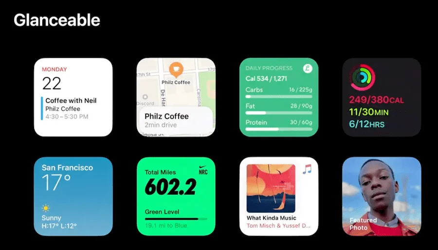
Users only spend a few seconds on their home screen before choosing an app to interact with, so at maximum your widget will get a fraction of this scan time. A great widget does not interrupt or distract the user, but gives them the relevant information quick enough for them to still remember what they were doing and only spend a few seconds on the screen.
Below are some examples of great widgets that only take about 2 seconds to glance at in order to get relevant information. The weather app is a great example, giving the user an update on what the weather is in their location without any sort of interactions from the user. It takes less than a second for the user to consume the content of the widget and extract meaningful information. The content is the focus.

Something worth noting from the WWDC talk is that the presenter specifically says that widgets are NOT mini apps. They purely project content onto the home screen, nothing more. If you have to add a button that permits user interaction, the widget is likely not glanceable enough.
Scrolling, interactive elements and videos/animated images are not allowed, so be prepared to design your widget with this in mind.
Relevant
A great widget displays the relevant information to the user with minimal user interaction. A great example of relevance is the calendar app widget, constantly updating to show the most relevant meetings based on the current time. This allows the user to glance without scrolling to the right time.

If a user wants to view more detailed information like who responded "no" to the event, they will have to click the widget and go into the app. Again, going back to glanceability, widgets are not mini apps — their purpose is to provide relevant information quickly without requiring interaction.
Another way to show relevant information is to utilize smart stacks, which show the right widget during the time of day (available to developers to customize via the APIs). So in theory if you have a bed-time app, you can showcase your widget closer to night time when it's relevant instead of during the day.
Personal
A great widget is personalized to the user. A very straightforward example is a weather widget, only showing the weather for the users current location. This widget would be much less useful if it showed the weather for New York for someone in San Francisco.
Aside from just allowing the user to set their current location within your app, you can go a step further allow the user to customize the size of the widget to showcase more information if they so choose. An example would be the weather app allowing the user to increase the size of the widget to showcase weather for the entire day instead of just the current weather. A user can choose to use the larger widget if it is important to them to know the weather for the week.

Conclusion
Widgets are a really powerful way to give users information without having to open your app. A user visits their home screen on average 90 times during the day, which means if a user installs your widget it will be getting a lot of screen time. Following Apple's guidelines and making your widget glanceable, relevant and personal ensures a great experience and increases the chance that a user will keep and use your iPhone home screen widget for iOS 14.
I highly recommend giving the WWDC session a watch if you want to learn more (https://developer.apple.com/videos/play/wwdc2020/10028) as well as reading the documentation if you are interested in building one yourself (https://developer.apple.com/documentation/widgetkit).
Now that iOS 14 is publicly available to owners of iPhone 6S and newer, we hope to see some glanceable, relevant, and personal iPhone home screen widgets. Let us know your favorite iOS 14 widgets at [email protected]!

.webp)


