Web UI, short for web user interface, is paramount to determining the success of any website. Understanding the importance of an efficient web user interface is a combination of artistic appeal and better practicality. Taking a creative approach is not always the best decision to make, and having a team of reliable developers who understand this can make a big difference.
But before you start choosing a design template to follow for your website, it's important to understand the fundamentals of a good web UI. Learning how to implement these practices can not only help your users navigate through your website more effectively, but it can also help in improving the overall traffic flow.
Our team at Aloa deeply understands that having an attractive yet reliable web UI is crucial to establishing brand identity. We empower our clients to discuss their overall web UI plans and implement them in the most efficient way possible with our partner software developers from across the globe.
By the end of this guide, you should understand the value of optimizing your web UI and have all the key components needed to develop the best user interface and experience for your web browser.
Let's begin!
What is Web UI?
Web UI refers to the overall user interface design of a website. Every visual element and layout choice made contributes to the clarity and usability of your site. A website's user interface directly contributes to the overall user experience (UX) of your users as well as the ranking in browser search sites like Google.
Good web UI focuses on creating a user-friendly experience while also having an aesthetically pleasing appearance. A well-designed web UI can make it easier for users to navigate through your site. Not only does a well-designed user interface look great, but it can also help improve the likelihood of users having higher engagement rates and conversions.
Web UI applies to both startups and large corporations, which can all benefit from emphasizing a user-centric approach to their users. Taking note of the needs and preferences of your target audience can help you gain a competitive advantage over other web browsers, especially when the design decisions are all aimed at creating a more positive and memorable experience.
How to Develop a Great Web UI?
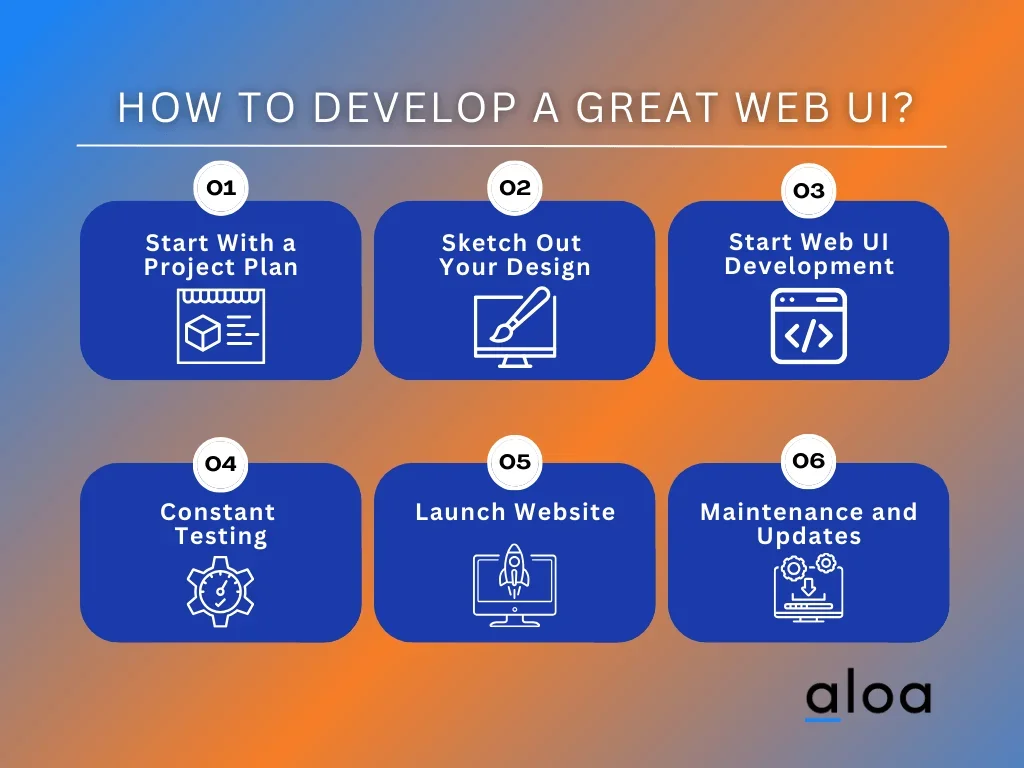
Developing a great web UI requires more thought than most businesses would expect. The entire process is a detailed, multifaceted task that involves careful planning, creativity, and attention to detail, all to improve user experience.
All in all, these steps are designed to help you with a great web UI:
Step 1: Start With a Project Plan
Project plans are at the forefront of developing a proper web UI. A great way to start your project plan is to first determine what your audience wants to see or click on. Components such as which aspect of the website you want your users to view first and the overall appeal of your website are all part of the planning phase of development.
Once you understand your audience and company image goals for your website, simplifying a project plan is much easier to achieve. As part of your project plan, don't neglect to include a detailed design brief that outlines all the details of your project.
Formulating a design brief is best described as looking into your audience's perspective when clicking through your website. These questions should be addressed as you create your design brief:
- What aspects or components of your site stand out?
- Which attributes make the site more accessible than others?
- How does the overall aesthetic design affect your view of this particular website?
- What interactable elements catch your attention the most?
- How does the website look and feel when using a mobile app?
- How is this website better than others in the same industry?
- What makes me want to go back to this specific website?
Answering those types of questions can help draft a more coherent design brief. Overall, your web UI seeks to target the questions that you have and address them in a way that affects the user experience in a positive way.
Step 2: Sketch Out Your Design
Before developing the actual web UI software, it's best to first sketch out some of the critical design elements that will formulate the fundamental choices of your overall user interface. Researching various competitor's designs can also help determine which features are essential in your particular industry.
Sketching the design with a graphic designer alongside a software developer can also open up more opportunities for discussion on whether the choice can lead to complications in user experience. Some key design elements to consider involve:
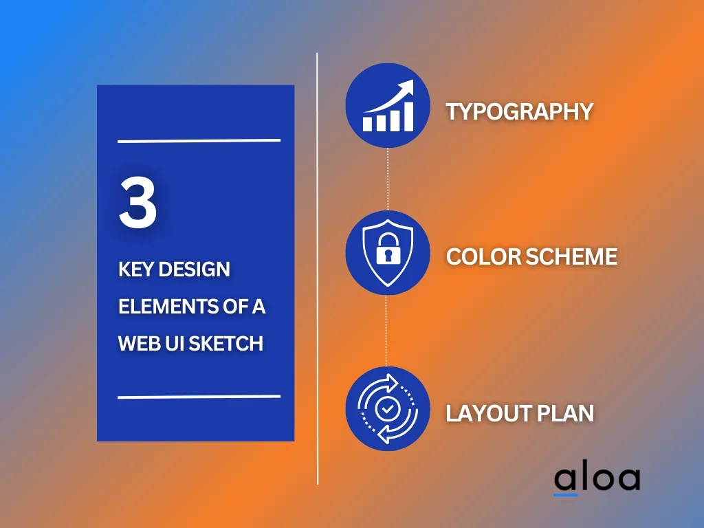
- Typography: The choice of font size and design can help make the web UI easier to understand for your audience.
- Color Scheme: Choose a harmonious color palette that directly corresponds with your brand identity. However, keep the color choices to a minimum to prevent oversaturating the website.
- Layout Plan: Sketching a layout design approach can help determine where the other critical elements, such as interactable elements, can fit in your website.
Step 3: Start Web UI Development
With the preliminary research and sketches out of the way, it's time to start hiring software developers who can implement your choices to the website. Developing an efficient Web UI design requires extensive coding knowledge on top of the design elements.
A better understanding of web development languages such as JavaScript and CSS can contribute to better responsiveness and implementation. However, the quality can broadly differ depending on the skills of your software developers.
The web development cycle may require some degree of trial and error. Some design elements might look great on a sketch, but responsively implementing the feature may be challenging if the process is too demanding. It's vital that there is constant communication and understanding between web designers and developers.
Step 4: Constant Testing
Developing a good web UI design will take time. Striking the balance between a creative brand identity and also being smooth and stable for it to operate to peak efficiency requires constant testing. Frequent test builds, and updates may be needed to determine if certain design elements are worth the performance loss on the browser.
It's also critical that you allow other close members to test out the new website themselves in a closed environment. This opportunity will enable members to discuss their feedback on things that can be improved, as well as provide a suitable means to test out the responsiveness of the browser itself.
Step 5: Launch
Once all the core issues have been addressed, it's finally time to unveil your new web UI to the public. Be sure to inform your audience about the changes to the new and improved web UI. In addition, make sure to keep a close watch on the data and feedback that your users leave out to see if there are any changes that you can implement before it starts to affect the overall user experience.
Step 6: Maintenance and Regular Updates
Over time, the combination of user data and changes in design trends will prompt the opportunity to make some changes to your website. Always keep track of the metrics of your website to search for more chances to provide better maintenance or patches to help stabilize the website more.
In addition, occasionally changing some of the design elements during significant changes, such as important holidays, can also lead to more engagement with your audience.
Best Practices to Follow for Web UI
Every website has its design choices that can make or break the brand identity of a company. However, user experience should always be considered when drafting the web UI design. Thus, it's crucial that you take a look at the following best practices to follow for effective web UI:
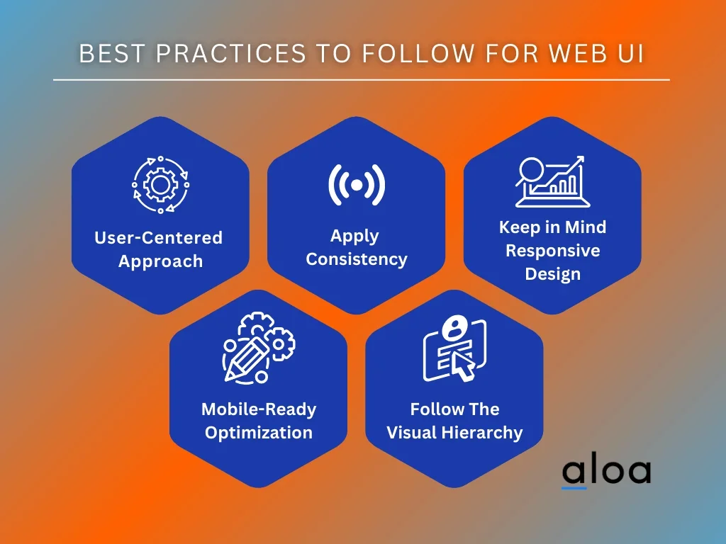
User-Centered Approach
Similar to any good business, it's crucial that your website should be treated with the same customer-centric approach that a physical store would implement. A user-centered web UI design will improve the usability and longevity of users clicking through your site. More clicks and views would mean the potential for increasing web traffic will drastically improve.
Apply Consistency
Consistency is key to maximizing brand identity. The available buttons and links must be all formatted similarly to allow users to have an easier time navigating through the website itself. A similar approach should be done with your choice of font design, size, and color schemes.
Keep in Mind Responsive
Responsiveness in a website is paramount with today's standards. Users would prefer to spend their time scouring through a browser more if the site not only looks but also feels professionally well-built. A crucial aspect of creating a website is to ensure that responsiveness is taken into account, especially with the drastic increase in mobile platform usage.
Mobile-Ready Optimization
With more users using mobile apps and platforms for web browsing, optimizing your web UI to handle these types of platforms are integral to improving the overall user experience. Neglecting one platform can lead to alienating a large portion of potential customers to your site.
Follow The Visual Hierarchy
Developing a website is no different than creating art. There are fundamental components that require a deeper understanding of the human mind and how it can vastly impact both the appeal and usability of the website as a whole.
The visual hierarchy showcases which aspects of a web UI are more critical than others. Here are the different tiers to follow in a visual hierarchy:
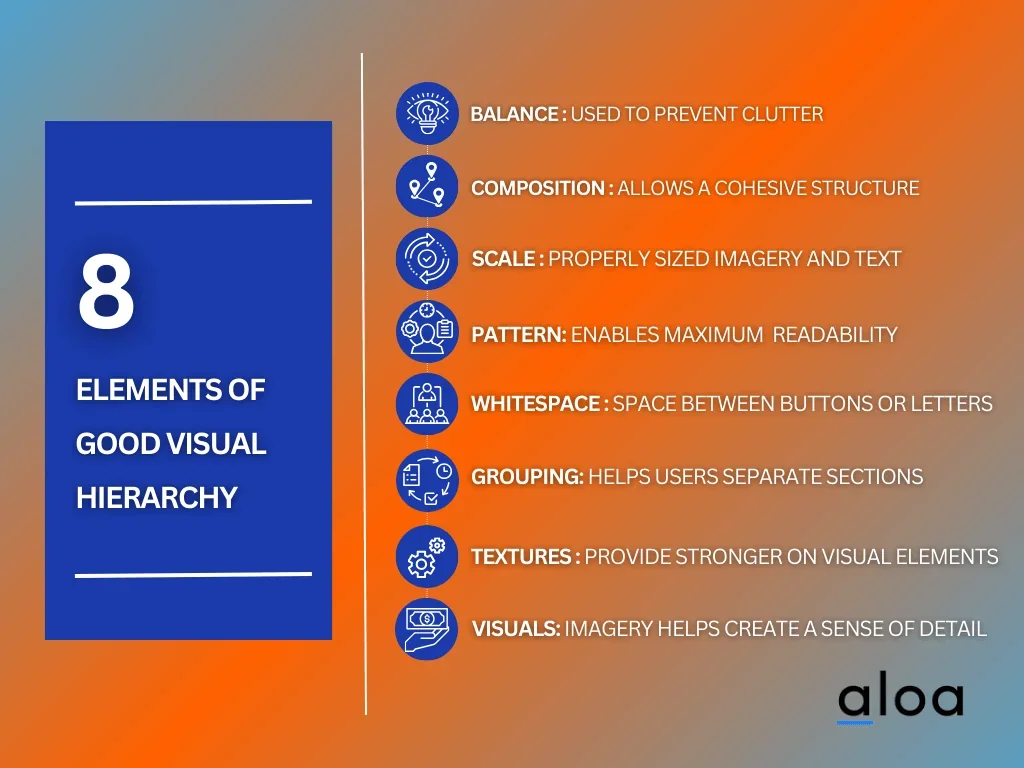
Balance
Balancing the imagery and components of the site can help prevent the page from looking cluttered and disorganized. Whether your site follows a symmetrical or asymmetrical design, distributing the key visual elements is a great way to strive for balance.
Composition
Composition order allows the website to construct a cohesive structure. Homepages or landing pages typically showcase large branding and a pivotal message to appeal to their audiences. However, following composition rules such as the rule of thirds can help make the entire structure viewable for its users.
Scale
Scaling a site involves choosing to make some imagery or fonts larger to grab a person's attention. However, scaling different components to irregular shapes or sizes can become confusing if done haphazardly. Keep the scaling structure to a maximum of three to five to maintain balance and composition.
Pattern
Studies show that people usually have a pattern when it comes to reading information, whether it is from a book, magazine, or website. The standard reading pattern usually follows an "F" or "Z" shape. Take that information into consideration when designing your web UI design for maximum potential and readability.
Whitespace
Whitespace in a website is more than just adding a plain white background. This component refers to including empty space by adding a monotonous color to add space between buttons or letters. Good whitespace usage can help direct readers' attention to other aspects of the web UI.
Grouping
The closer different web UI components are to each other, the higher the likelihood that users will associate one aspect of the website with another. Grouping is critical to ensure that users will have an easier time understanding where the separation is from one section to another.
Textures
Textures provide a stronger emphasis on various visual elements in a web UI. Combine bold yet simple textures alongside dull whitespace to maximize clear attention to users. A useful tip is to consider tools that let you seamlessly change image background for visual enhancement. Typical uses of textures are for call-to-action (CTA) portions of a web page.
Visuals
High-quality imagery helps create a sense of detail that enforces the overall brand integrity and imagery. Incorporating responsive movement to the visuals, such as a carousel effect, can help improve the impact and appeal of visuals to the web design.
Key Takeaway
Web UI is a key factor in improving a website's appeal and user experience. Utilizing good and efficient practices when designing a web UI will not only help your audience engage more with your site but also encourage more clicks and long-term engagement.
If you're ready to partner with software developers who understand your goals for an effective web UI, contact us at [email protected] to get you started.

